Disclaimer: I will be unable to display unreleased UI mockups beyond marketing material.
TeletracNavman creates software that tracks assets. Assets are vehicles, trailers, and cargo just to name a few. Seems simple enough right? I mean, our phones track our location, what else would we want to track?
That is what I thought when I first joined the team as the sole Interaction Designer. Boy was I naive.
Users want to track more than just the location of their "stuff". They want to understand how their "stuff" is being used. They want to know the cost of operating a fleet of dozens or hundreds of vehicles. Users want to know if their employees are safe or when they need to take emergency actions. They want to know if their "stuff" is out of operation, in the repair shop or gone missing. Users want to know the return on investment of this "stuff".
The complexity doesn't stop at the endless use-cases. There is an array of asset devices to support, each providing unique metrics to process. The users we provide to all have different nuances in their jobs with very specific needs from their respective industries. Oh, did I mention that we serve a global customer base? Regions have their laws and regulations to follow too.
Key Takeaways
Before I get into the details of what I have learned during my time at TeletracNavman, I want to give an overview for those who like it straight to the point! I get it, I am the same way!
User research is essential when meeting the various needs across industries and regions. These two variables alone multiply the possible personas exponentially. R&D teams need to consistently get user feedback from all these personas to make sure our product is powerful yet flexible to meet their needs.
An analogy I love to use to stakeholders when evangelizing the importance of UX research early on is this: Are we making Photoshop or Canva?
If you are familiar with these products, you know they both enable a user to create graphics. For example, both products meet the needs of a social media manager, who may want to create engaging posts on Instagram. However, in the hands of a movie poster artist, graphic designer, or photographer, Canva is simply not powerful enough. Photoshop, while it is more complex and may require some training to use, is far superior when creating detailed, industry-standard graphics. Photoshop meets the need of many different types of artists and creators when compared to Canva. To put it in other words, both products meet the needs of some personas, but not all personas. So, which type of product are we creating?
In the UX/UI space, sometimes we focus too much on creating a "Canva". We try to create perfect, clean, simple, mobile experiences, which is great in the right context. What I had to learn - or perhaps better say, unlearn - from my time at TeletracNavman, is it's okay to have a complex user interface if we expect the user to accomplish complex tasks.
Photoshop is complex, but it is powerful. Managing 1000+ vehicles and assets across 1000+ miles with 1000+ drivers is complex. I design a complex but powerful system so users can achieve this. We tried designing a "Canva" and that narrowed the personas we could serve. We have dozens of personas, industries, regions, and policies to consider. Leveraging UX Research practices is the first step to simplifying this complexity.
Design Systems Evolve
In my 3+ years at TeletracNavman, I have gained a tremendous amount of experience designing complex systems. My designs have been developed, broken, and conceptualized again and again.
If I was to go back in time with the knowledge I know now, I would push for the lead time to establish a robust design system that could scale. As we know, development is never a smooth process. Scope creep is sometimes inevitable, priorities change, and technical hurdles can derail direction.
I helped establish a design system early on, but it was difficult to scale. We lacked atom-level Figma components that allowed our team to build reusable components. This resulted in design debt caused by one-off design assets in areas of our prototypes where core components should have been used. Sometimes, this is inevitable. Use cases get refined more and context-specific components need to be created. Regardless, a rigid design system does not allow it to evolve or scale.
If there are inconsistencies in prototypes and designs, there will also be inconsistencies in the product. Moving forward, the team and I have created core components in Figma. Within those Figma files, there is also documentation on the dos and don'ts when using each component. We are also closely working with POs to get proper design QA. These processes alone have allowed our design systems to evolve as it also allows us to get feedback on how developers are consuming our artifacts.
Knowing is Half the Battle
A developing initiative that we are refining is our UX research processes. As I have mentioned before, we have many regions and industries that our product serves. These two variables exponentially increase the personas we need to understand.
For example, driver compliance rules are unique in different countries. There are different policies a US driver may need to follow compared to drivers in New Zealand. The size of vehicles fleets or the devices they integrate brings nuances to each company.
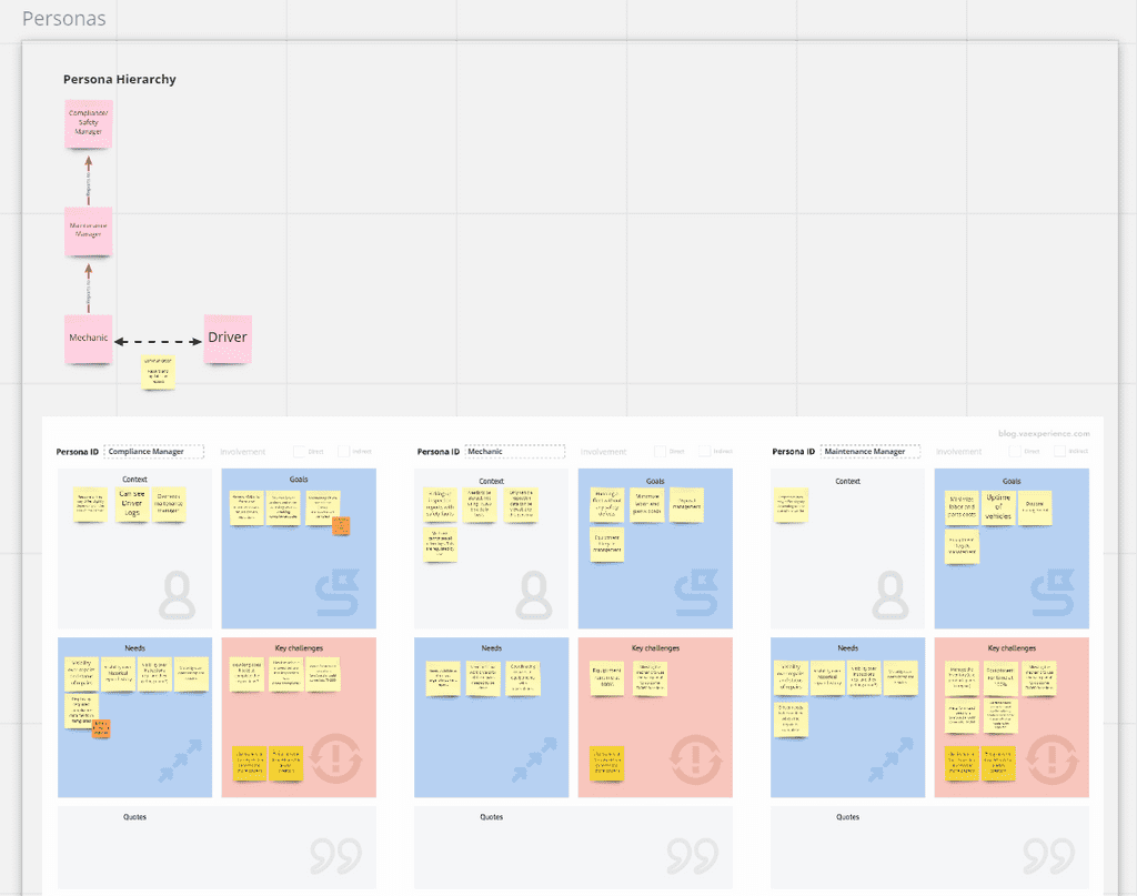
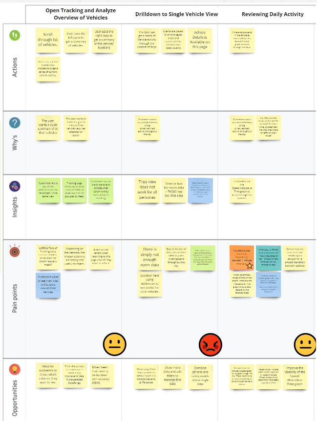
The only way we bring sanity to the sheer amount of personas we serve is through continuous and extensive user research. We do this by maintaining Miro boards of various UX research artifacts such as empathy maps, persona boards, and journey maps. Here are some examples of such artifacts.

Journey maps have been espeically useful in helping capture pain points in a chronological context. In our products, there are numerous workflows and processes we guide our users through. Therefore, adding the dimention of time into our research allows us to better understand where users are getting stuck or using unknown workarounds to get their tasks completed.

These are just a few artifacts that I can use to show the type of research that goes into crafting industry-leading UX. With the help of these artifacts, we are able to quantify the importance of early user research to stakeholders which, in return, we've seen a greater effort focused on getting this feedback.